Europe’s 2019 Heat Wave: The Rest of the Story
By Robert Endlich -- September 12, 2019“The caterwauling from the mainstream media – and claims that 2019’s hot summer was part of human-caused CO2-fueled global warming and a direct cause of alleged extreme maximum temperatures – are just not true. Analysis of the claims and events reveals these were simply hot weather events in a warm summer; claims of new extremes are far-fetched and fade under scrutiny.”
“[T]he BBC report quotes Cambridge University Botanic Garden director Beverley Glover: ‘However, we can’t help but feel dismay at the high temperature recorded and the implication that our local climate is getting hotter, with inevitable consequences for the plants and animals around us.’ If you look at the data you see that this was a one-day weather event; the summer of 1976 was a lot hotter and occurred during the 1970s ice age scare.”
The summer of 2019 was hot in Europe, but the claims of new extreme record maximum temperatures, of sled dogs in Greenland mushing through never-before-heard-of water on the ice sheet, and of direct links to human use of CO2-emitting fossil-fuel energy are incorrect and lacking due diligence. Here is the rest of the story.
The CNN Photo
We start with a CNN story that had this breathless paragraph:
The incredible photo he took, of sled dogs ankle deep in a wide expanse of light blue water, quickly went viral, destined to join pictures of starving polar bears, shrunken glaciers, stranded walruses and lakes turned bone dry in the pantheon of evidence of our ongoing climate catastrophe.
Climate catastrophe? The alarmists quickly sent it around as “evidence, proof positive.” But it took just a few days for Danish Arctic experts to reveal the rest of the story – the facts. Another Dane, economist and environmentalist Bjorn Lomborg, provided additional details (Figure 1).
This is not an especially rare event for June. Indeed, the photo was taken near Qaanaaq, about 60 miles north of US Air Base at Thule, Greenland. At over 77N latitude, this area enters the “midnight sun” on 15 April and does not exit midnight sun conditions until 20 August. Thus, when the photo was taken on 13 June, the area had been in 24 hours of sunlight for almost two months – much of it very warm and direct. That sunlight might be expected to melt the snow on the sea ice surface, and indeed it did.
Simply put, this is not a rare event at all, as the CNN story wanted viewers to believe, prompting the network to design and slant its pretend “news” story to mislead viewers about “dangerous ongoing manmade climate change.” The supposed “evidence” was doctored or misrepresented to support the conclusions the CNN writers wanted viewers to come away with. Mission accomplished.
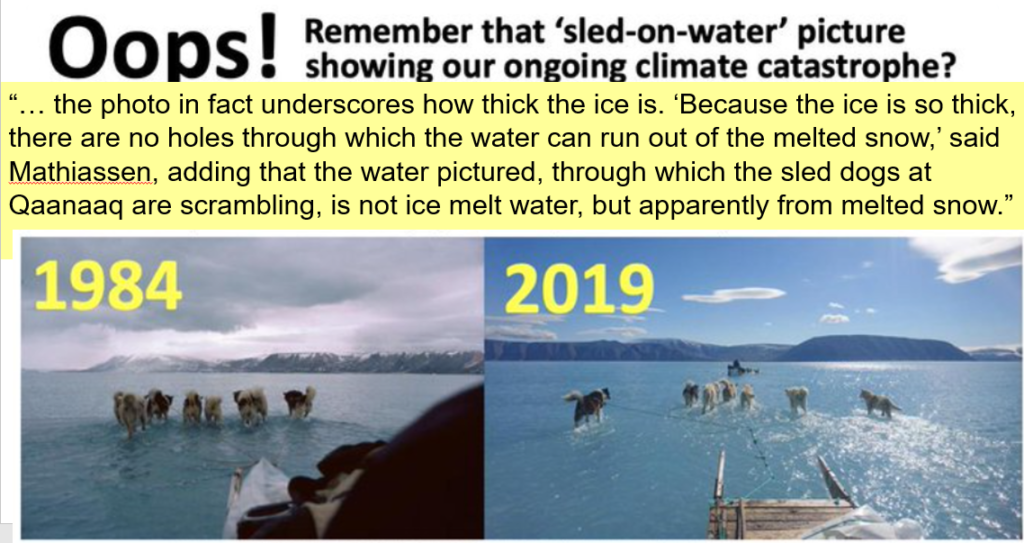
Figure 1. Image from Bjorn Lomborg, who showed that this is not the “ongoing catastrophe” that CNN claims. It is only one of several such incidents that have happened in the past and will happen again. The area’s Natives even have a word for this phenomenon, imaq (‘everything is water’), and now adjust by putting plastic sheets on the bottom of their sleds when this happens. Look carefully; you can see the plastic sheets. Figure 1 and the other figures here were taken from the author’s presentation to the Cruces Atmospheric Sciences Forum 17 August 2019 meeting and are online here.
Standards Not Observed or Enforced
The story soon shifts to Europe, before returning to Greenland. But first a brief review of the international standards on the exposure of thermometers, standards which enable a key element in science to be exploited, especially in operational meteorology, replication of results. It turns out it is not too difficult to stick a thermometer outside to get a hot temperature reading.
During the day when the sun is shining, surfaces like pavement, asphalt, bare dirt and flagstone walkways get very hot, as I learned as a barefoot kid walking back to the car after a day at the beach. You soon learn to avoid such hot zones by walking on white sand, grass and the white crosswalk marks instead of black asphalt.
To get repeatable results that accurately measure air temperatures, the instrument cannot be close to the ground and must follow the standards outlined below.
Another principle in getting replicable results for air temperature is to keep sunlight from falling directly on and heating up the thermometer itself. So, a second rule provides that liquid-in-glass-thermometers must be screened from direct solar radiation. Here is an example of such a Stevenson Screen; unfortunately, it is mounted incorrectly, since the sun is shining on the side with the door. The sun should never be allowed to shine on the instruments inside. “Wikipedia, we have a problem.”
You can also get much too hot air temperature indications if your thermometer is close to asphalt, buildings, walls, rock cliff faces, air conditioner exhaust, metal equipment shelters, jet engines at airports – and the list goes on. The World Meteorological Organization thus publishes standards for meteorological instrument exposure.
The most reliable observations for climatological statistics come from “Class One” stations, the most important elements of which are:
| 2.2 | Class 1 |
|
(a)
Flat, horizontal land, surrounded by an open space, slope less than ⅓ (19°); (b) Ground covered with natural and low vegetation (< 10 cm) representative of the region; | |
| (c) | Measurement point situated: |
| (i) |
At
more than 100 m from heat sources or reflective surfaces (buildings, concrete surfaces, car parks, etc.); |
(ii) At more than 100 m from an expanse of water (unless significant of the region);
Who enforces the standards? The National Offices for Meteorology in the member countries are supposed to. In reality, most likely no one does. Indeed, in the USA the situation got so bad with suspected poor thermometer exposure that Anthony Watts and Roger Pielke crowd-sourced an effort to audit US stations.
Their results are online at www.surfacestations.org; a downloadable report can be found here.
The poor results for the USA were noticed. The GAO opened this finding: “Climate Monitoring: NOAA Can Improve Management of the U.S. Historical Climatology Network GAO-11-800: Published: Aug 31, 2011. Publicly Released: Sep 30, 2011.”
Other researchers discovered that the German Weather Service DWD and the UK Met Office clearly know that the standards are not being met. Nevertheless, they happily join the chorus of “climate catastrophe” and allow the entry of extreme high temperature records for sites within their purview at stations which clearly do not meet Class One standards set by the World Meteorological Organization.
Unfortunately, it seems the WMO itself is in on the con: It is the host organization for the Intergovernmental Panel on Climate Change.
Europe’s Heat Wave Was Forecast
For Operational Meteorologists, forecasting a coming heat wave or cold wave is relatively easy, a lot easier than forecasting the exact track of a hurricane days in advance, for instance. The 2019 heat wave in June was such an event, because it followed the development of an “Omega Pattern.” When it gets more pronounced, we call it an “Omega Block,” which can last for a week or more. The 2019 event in Europe was fully expected a week prior to its onset.
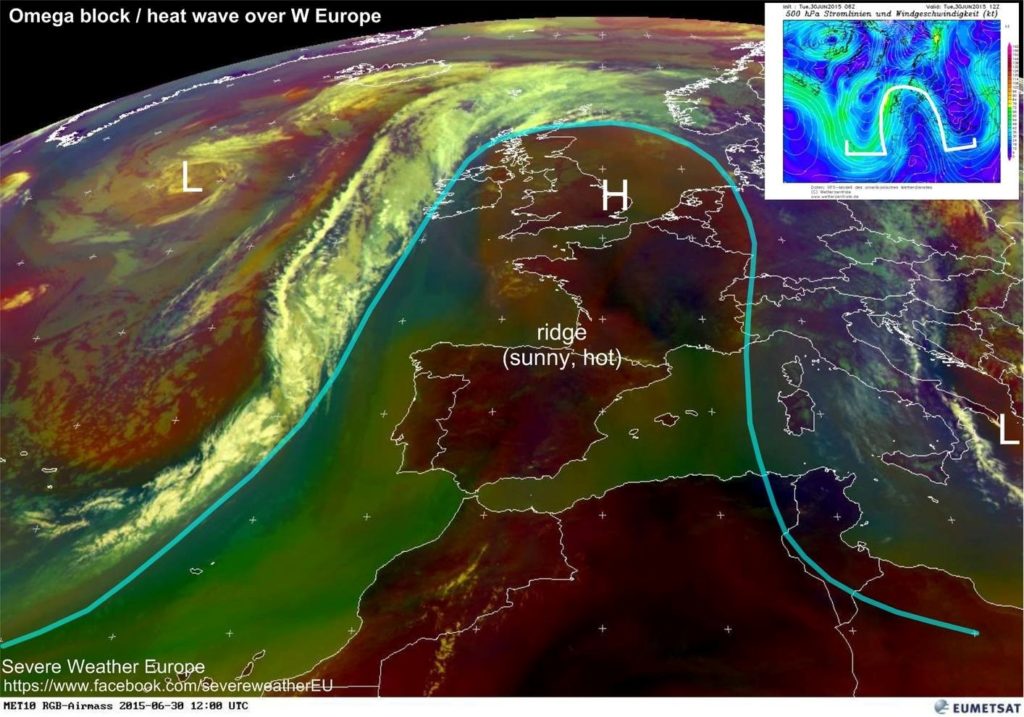
Figure 2. Example from 2015 of an Omega Pattern. Note the offshore Low with the L in the west, and the familiar (to operational meteorologists) comma shape to the clouds, High pressure centered over England’s East Anglia, nearly clear of clouds with the H. The High pressure brings subsiding air, few or no clouds and very warm conditions. Off to the east is another Low-pressure area, indicated by the L near the bootheel of Italy. The L H L pattern is diagnostic of this pattern and its characteristic weather.
The 2019 Omega Block was especially brutal because of its onset at the summer solstice, those days of the year when the days are longest, and the solar heating is the maximum possible. This one, as in many previously, was enhanced by the proximity of Europe to North Africa, so the southerly winds on the front edge of the Omega Pattern brought “the giant Saharan air plume.”
This story from the UK’s Sun newspaper set the right tone and substance with the quote:
Meteorologists say hot air drawn in from northern Africa is responsible for the heat wave, caused by high pressure over central Europe and a storm stalling over the Atlantic.
The phrase “storm stalling in the Atlantic” is an important component of the development of the Omega Block described above, so this paper got it right.
Sadly, the AP joined the warmist crowd, as it usually does. “Scientists link Europe heat wave to man-made global warming,” it claimed, despite the fact that this was a well-anticipated Omega Pattern exactly at the time of year that the sun’s influence would be the strongest possible for the entire year, and despite knowing a Sahara Air Layer Weather Event was coming and had been advertised to the public well before the onset.
To be clear, it was a weather event.
French Frying?
I won’t get into the new record for France proclaimed by Meteo France, their national weather service, because there has been confusion as to exactly which thermometer in Gallargues-Le-Montueuex set the 28 June 2019 record, and no photo of that exact site was made available. The purported new records in Germany and England, which follow this discussion of France, do have photos of the specific sites involved.
Dr. Roy Spencer had these comments: “Record high temperatures in France: 3 Facts the media don’t tell you”:
- Record high temperatures occur (and occurred in the past) even without global warming
- Summer heat waves are weather-related, and unusual cold is usually nearby
- Most recent thermometer measurements have been spuriously warmed by the Urban Heat Island (UHI) effect
The strong winds from the south, the Sahara Air Layer, and especially the growth of Paris over the past 60 years led Tony Heller to say, “On 25 July 2019, Paris Le Bourget Airport reached 106F, one degree warmer than the 1947 peak. This is not surprising because the wind was blowing from the south across the massive Urban Heat Island of Paris.”
The 1911 heat wave in Paris claimed over 40,000 dead, mostly babies. Many in Paris had no water. La Parisien spoke of “victims mowed by the heat and its consequences,” and “the mortal enemy is diarrhea, which is ravaging all across France.”
On the Ground in North Germany
I was fortunate to spend over 21 years as a Weather Officer in the US Air Force. My first trip to Europe was to arrange and oversee a US meteorological ground station at Meppen, Germany. During this assignment I was on flight status for the USAF C-130A Optical Physics Flying Laboratory. Our crew participated as part of the US component of a NATO project, OPAQUE, Optical Properties of Atmospheric Quantities in Europe.
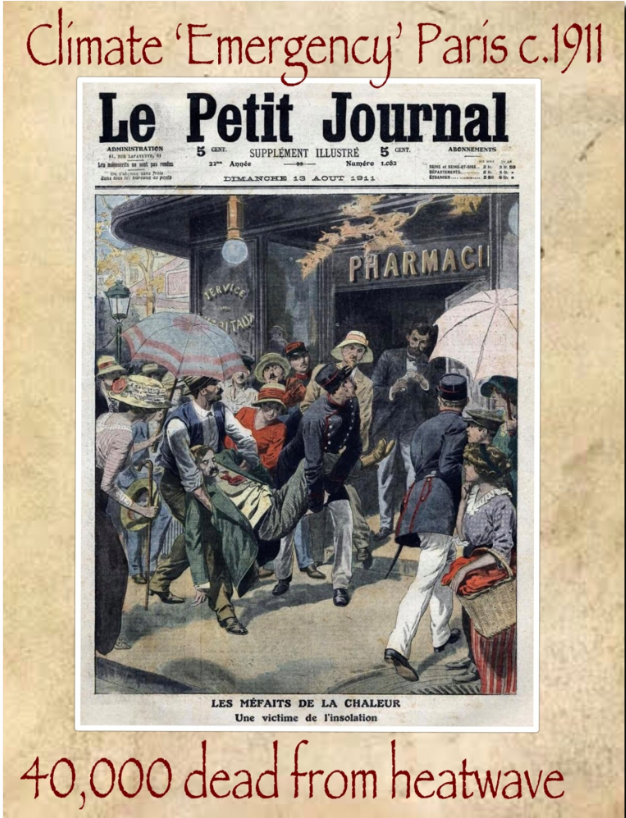
Figure 3. This graphic is adapted from a story in La Parisien about the 1911 heat wave which struck France and Germany for at least two months, causing a death toll in the Paris Region of 41,072. H/T Tony Heller.
These duties involved operating equipment in the aircraft which we flew from the German Air Base at Wunstorf and profiled the atmospheric properties directly over the Meppen ground station. I also participated in flights from RAF Mildenhall during OPAQUE in 1975 and 1976.
These experiences gave me direct on-the-ground experience very close to the stations for which record high surface temperatures were claimed in 2019 by the German Weather Service, DWD, and UK Met Office.
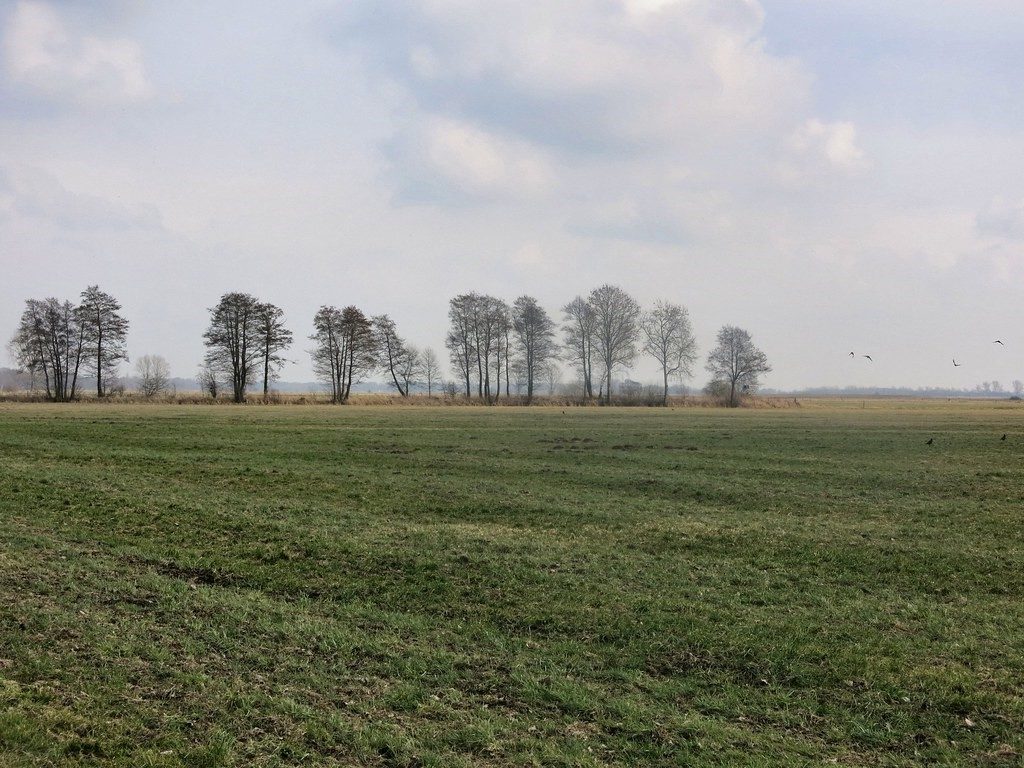
Figure 4. Image of the North German Plain found on Google. Meppen, Germany was chosen to be representative of the North European Plain military “Avenue of Approach” should the USSR have invaded towards the Netherlands from Russia or Poland during the Cold War. When I was a Weather Officer in the US Air Force, I helped set up the US meteorological ground station at Meppen, in 1975-76, an area which looked very similar to this.
On the North German Plain in this area, close to the Netherlands border, the weather on the afternoon of 25 July 2019 was similar to the past days: a string of clear or nearly clear skies with southwesterly winds. On the ground, this area is drained by the Ems River (pronounced “Ames”) and the area is called Emsland. On the afternoon of 25 July, the DWD station in Lingen recorded 41.5C (106.7 F), which is now called the new extreme maximum temperature for Germany. It is a very short distance, 25 km or 15 miles, north from Lingen to Meppen, where I also worked on the US surface measurements for OPAQUE.
When the 25 Jun 2019 weather data came in, it was 3C or 5F hotter in Lingen than nearby Meppen. Since there were no nearby thunderstorms, cold fronts or areas of disturbed weather that day, and the area is very flat, the maximum temperatures should have been close to each other.
It was only a matter of hours later when the DWD declared the new extreme maximum temperature for all of Germany – and only a short while after that when meteorologists familiar with the area cried foul because of non-compliance with WMO surface observation standards, with one blogger living nearby using the terms “cheated” and “lousy station siting.”
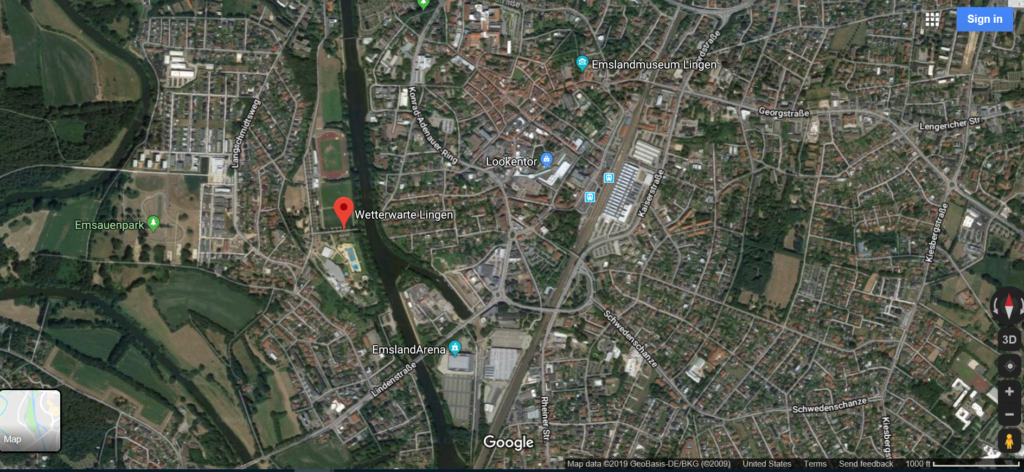
Figure 5. Google Satellite Map for the Lingen DWD station, marked near the center of the image with the red tag, “Wetterwarte Lingen,” “Lingen Weather Station.” Legend lower right shows 1000 ft distance marker. The Lingen DWD station is in an urban environment not far from the city center, is affected by the Urban Heat Island, and when closely examined, has very poor exposure of meteorological instruments.
Soon thereafter, the Twitter feed # Lingen had photos and stories of the Lingen weather station and a graph showing an upward trend in Lingen’s surface temperatures compared with nearby reporting stations. Damning, at least to me, were the photos displaying the surface observing instruments in conditions far from Class One WMO standards, Figure 6 below.
The Lingen DWD site is cluttered with equipment shelters, heat sources with the sun shining directly on their west facing sides as seen in Figure 6. The thermometer is only a foot or less away from the 5-foot hedge which itself is only a few feet from the 45-foot tree line on the east side of the site. Also, the site sits in a prominent bowl, the steep west side of which is marked by the stairway and hand railings for walkways leading to the DWD office and observatory. The observatory-office is marked with the vertical antenna near the right side of the photo.
The presence of the 5-foot hedge and the 45-foot tree line on the east side (left side Figure 6) of the site restrict the free flow of air to ventilate the thermometer. Figure 6 shows the sun reflecting off the hedge and the tree line, which would tend to heat the thermometer and its mount. The site is clearly not in compliance with WMO Class One measurement standards, which require a flat open space, slope less than 19 degrees, and the ground covered with natural and low vegetation no higher than 10 cm or 4 inches.
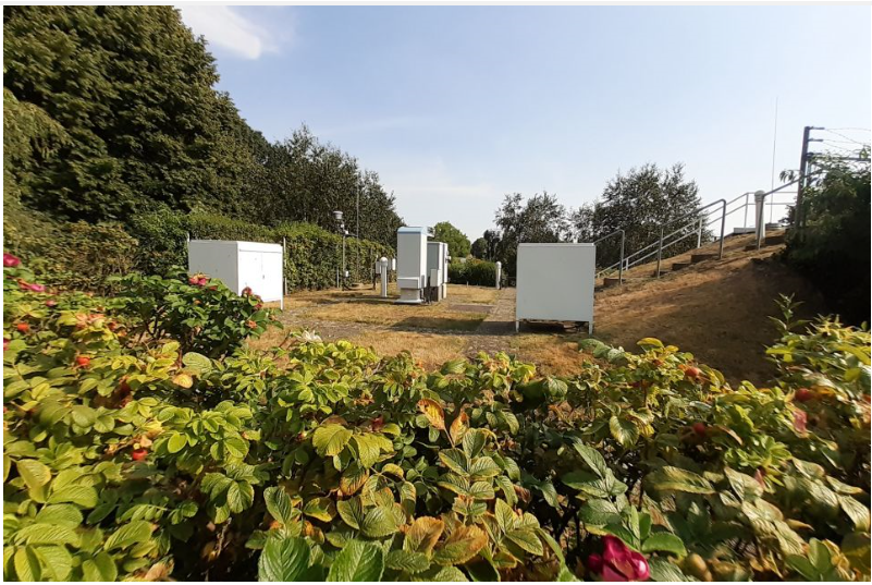
Figure 6. View of the surface observation area for the Lingen DWD station, looking south, on an almost- clear day late in the afternoon. The sun is shining directly on the west-facing sides of the large equipment shelters 4, 5 and 6 feet high. The shielded thermometer is the white device with the pie-shaped roof affixed to a pole along the 5-ft hedge on the right, in the middle distance. I found the photo on Twitter # Lingen.
Cambridge Reports Extreme Reading at Cambridge University Botanic Garden.
While I was with Project OPAQUE, we flew the C-130A Flying Laboratory out of RAF Mildenhall during our flights over the UK ground station. When the aircraft was down for maintenance, I visited nearby Cambridge (19 miles away). I re-visited Mildenhall and Cambridge in 2013.
The allegedly highest-ever recorded temperature in England occurred at the Cambridge University Botanic Garden. The extreme maximum temperature, 38.7 C (101.7 F), was reported for the afternoon of 25 July 2019. The BBC report provided pictures of the Stevenson Screen at the Botanic Garden, and once again it is clear that the site does not meet the WMO Class One observing standards for surface temperatures. (More about this below.)
In the Cruces Atmospheric Sciences Forum, we are quite aware of another phenomenon which can lead to unrepresentative hot surface temperatures, the Urban Heat Island effect. We have made observations and posted the results of the HI effect in Las Cruces by making range-quality measurements of the UHI during traverses of the city.
In Cambridge, another more rural Met Office observing site is the National Institute of Agricultural Botany, NIAB. Thus an obvious first step was to examine the data to see if the NIAB site was warmer or cooler than the Cambridge University Botanic Garden. The NIAB’s maximum temperature on 25 July was 38.1 C (100.6 F), compared with the Botanic Garden’s 38.7, a clear indication that the Botanic Garden seems affected by the Cambridge urban heat island.
The BBC image of the Stevenson Screen shows why this supposed new record should be rejected. It clearly shows the problems with the observing site and its non-compliance with the WMO Class One standards.

Figure 7. Stevenson Screen where the purported highest temperature ever recorded in England was reported for the afternoon of 25 July 2019. The photo, part of the BBC report, is taken facing northwest on the campus of the Cambridge University Botanic Garden, with the Sainsbury Laboratory directly in back of the screen, while the green trees to the right are part of the Plant Growth Facility. Paul Homewood’s blog post on this event has an overhead image of this site when the Sainsbury Laboratory was under construction; it shows both buildings well-within the 100m distance described in the WMO Class One standards, close to 35 meters away from this thermometer.
Here are the problems with this site: The thermometer and screen obviously are not in a clear open space. Huge buildings well within 100 meters violate the clear open space requirements of a Class One observing site. The bare dirt in the mid-field of the photo has different thermal properties from the grassy area of the foreground and makes the site non-representative. Bare dirt gets a lot hotter than grass-covered surfaces. Plus, Cambridge University and the City of Cambridge are growing, making the Urban Heat Island-contamination worse.
(There is a brief discussion of the Urban Heat Island and the problems of getting a long enough temperature record to avoid non-representative effects of 60-year climate cycles here).
My spring 1976 OPAQUE deployment was at the beginning of the hot 1976 summer in Europe, especially the UK.
“The long hot summer of 1976 which eventually ended in September of that year, was the culmination of a 16-week dry spell – the longest recorded over England and Wales since 1727,” the UK Met office states.
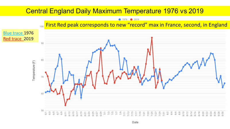
Figure 8. This graphic, adapted from a similar one by Tony Heller, compares the Central England Temperature daily maximum in June, July and August. The Blue trace is the temperature in 1976, the Red is 2019. The British Met Office called the associated 1976 dry period “the longest since 1727.” The summer of 1976 is considered by Wikipedia as, “one of the hottest summers in Europe (and especially the United Kingdom within recent memory.”
To give a flavor for the knowledge of “experts” quoted in the media, the BBC report quotes Cambridge University Botanic Garden director Beverley Glover: “However, we can’t help but feel dismay at the high temperature recorded and the implication that our local climate is getting hotter, with inevitable consequences for the plants and animals around us.” If you look at the data you see that this was a one-day weather event; the summer of 1976 was a lot hotter and occurred during the 1970s ice age scare.
A Committee Approach? Maybe So
The 2019 alleged extreme maximum temperatures were proclaimed within hours by the national weather services in Germany, France and the UK.
Within the USA there is a National Climate Extremes Committee (NCEC) and State Climate Extremes Committees which are called on when a weather event seems to have possibly tied or broken an extant record. Experts are brought together to offer expertise from National Centers for Environmental Information (NCEI) and additional representatives from the National Weather Service’s (NWS) “Analyze, Forecast and Support Office” and a designated representative from the American Association of State Climatologists (AASC). Mature people with expertise consider the evidence.
It seems to me that the USA might have a better idea than these Europeans, who have within hours proclaimed new extreme maximum temperatures even though it is blazingly apparent that no one is enforcing the standards promulgated by the World Meteorological Organization at the very sites where these “extreme” temperatures are alleged to have occurred.
Such is the state of critical thought within this science – my science – and further evidence that this is about politics, not about science.
Toward Summer’s End: Alarmist Cries About Greenland
Near the beginning of this article, I mentioned that we would return to the subject of Greenland.
On 8 August 2019, a Washington Post story led with, “Greenland is on track to lose the most ice on record this year and has already shed 250 million tons.” The subhead was, “Arctic sea ice is also at a record low, as warmer than average summer takes its toll.”
The Danish Meteorological Institute has world-class experts who report on Greenland’s daily “surface mass balance” and “accumulated surface mass balance” on a day-by-day basis as the season develops. Starting at DMI’s Polar Portal English language version, “Monitoring Ice and Climate in the Arctic,” the Greenland>Surface Conditions Tab brings up a map, and the bottom has a Surface Mass Balance graph.
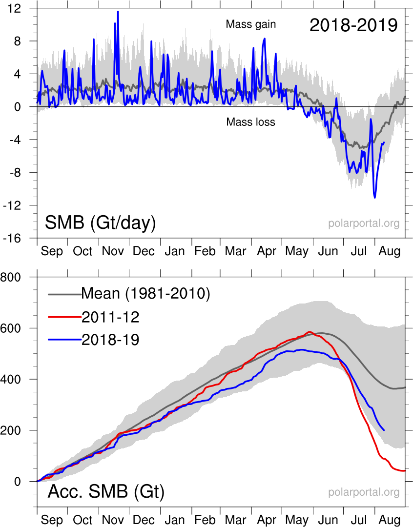
Click the “Large Version of Latest Graph.” An image similar to the one below appears. As said above, the data are kept up on a day-by-day basis; this one was for 23 August 2019, but other dates can be chosen
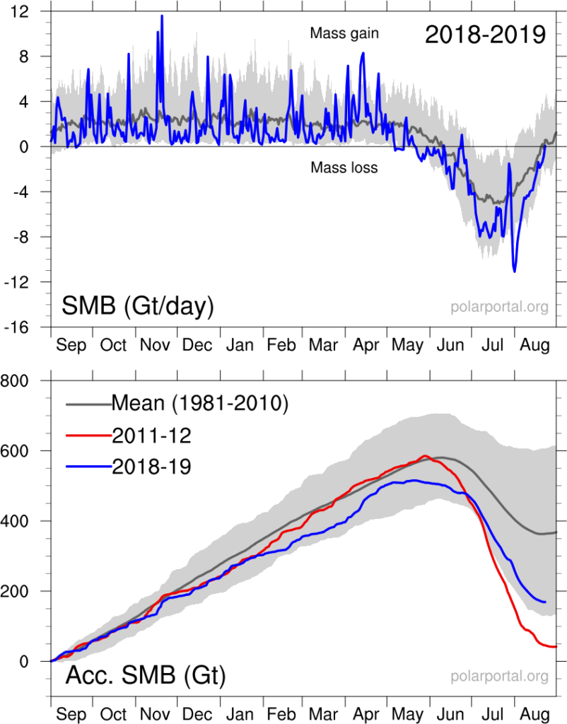
Figure 9. Polar Portal’s Surface Mass Balance, “SMB”, top, and Accumulated Surface Mass Balance, “Acc SMB,” bottom. Both graphs start 1 September, the beginning of the snow year in Greenland. The top graph shows the 2018-2019 snow and ice year, which began 1 September 2018, and as of this writing on 23 August 2019 had only a week to go in this snow year. The top part of the top graph shows daily mass accumulation period from 1 September 2018 to about 1 June 2019 as the bright blue line, and thereafter, the melt season, with daily mass losses. There was a snowstorm on 1 July 2019, which briefly added a couple of gigatons; this happened after the summer melting season had started a few weeks prior. The bottom of the chart shows the accumulated surface mass balance for the 2018-19 snow year in bright blue, the entire very warm year of 2012 in red, and the 30-year average, 1981-2010, the dark grey curve.
The blue curve at the top of the graph shows the current year’s surface mass balance measured in gigatons (1 Gt is 1 billion tons and corresponds to 1 cubic kilometer of water) on a day-by-day basis. The snowstorm on 18 November 2018 dumped 10 Gt snow, and another snowstorm on 20 November dumped an additional 12 Gt.
The light grey area in the top graph shows the range of accumulation over the 30-year mean 1981-2010, but after 1 June you see the melt season.
The bottom of the chart shows the Accumulated Mass Balance with solid lines for three periods, the red curve is the very warm year 2011-12, the bright blue line is the current year which, on 23 Aug 2019, had only a week (of mostly melt) to go for the balance of the ice year.
The dark gray curve traces the mean value of ice accumulation from the period 1981-2010. The light gray area on the bottom shows the range of accumulated mass over the 1981-2010 period.
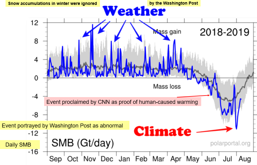
Figure 10. Surface Mass Balance chart adapted from Tony Heller. The melting event on 13 June 2019, labeled in pink, was proclaimed by CNN as proof of human-caused CO2-fueled global warming. There was a snowstorm a few days later, about 1 July, when two gigatons of snow accumulated, even though summer had already started. The large melting event about 1 August was enough for the Washington Post to claim untoward melting was happening in Greenland, but it was just a warm weather event followed by cooler days and seasonable surface mass balance amounts.
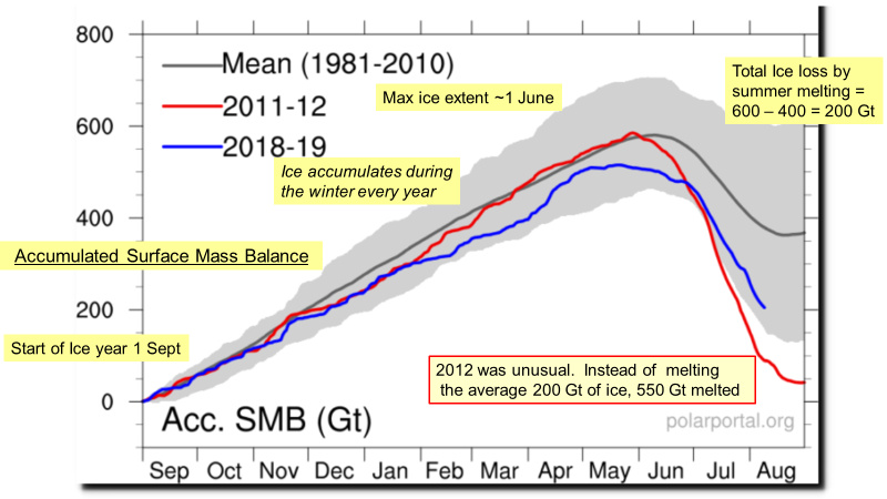
Figure 11. Accumulated Surface Mass Balance; three different periods are shown. The gray solid line shows that, on average, Greenland accumulates 600 Gigatons of ice and snow between 1 Sep and 1 June, then loses 200 Gigatons by 31 August. Therefore, 400 Gigatons are lost when icebergs break off Greenland; otherwise Greenland would be increasing its maximum height above 12,100 feet MSL every year. In 2012, a very warm year, 550 Gigatons of ice melted, much different from the average. The 2018-19 year in blue shows that even though this was a very warm year, the loss was within the 30-year average.
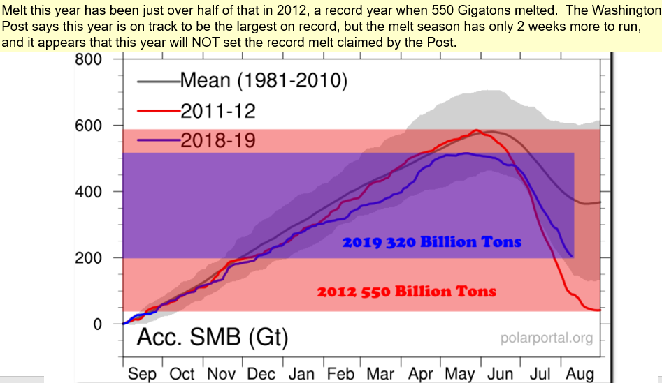
Figure 12. Accumulated Surface Mass Balance chart adapted from Tony Heller. The record melt over the entire 2012 melt year is plotted in red; the 2012 loss was 550 Gt. The 2019 melt year is plotted in blue, and 320 Gt has melted to date, with only 2 weeks to go in the melt year on this chart. It certainly looks as if the Washington Post claim of 2019 being on track to “lose the most ice on record” is speculation which will not be met.
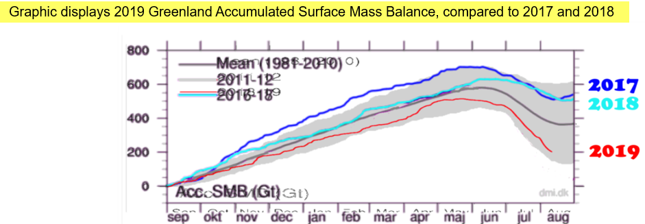
Figure 13. This graphic, also adapted from Tony Heller, shows the accumulated surface mass balance over the melt years 2017, 2018, and 2019 year to date. The Washington Post story on 8 August 2019 by Andrew Freedman of the Capitol Weather Gang mentions strong melting in 2019 but does not mention the very strong ice accumulations over the two previous years. This is an attempt by the Washington Post to be deliberately deceptive with an alarmist slant, rather than to be informative of recent ice accumulation and melt history.
That 8 August 2019 Washington Post Story subhead said, “Arctic sea ice is also at a record low as warmer than average summer takes its toll.”
The Polar Portal home page also has a Sea Ice and Icebergs tab with a selection choice of Sea Ice Extent and from that page the ability to select the Large Version of Graph, example seen below:
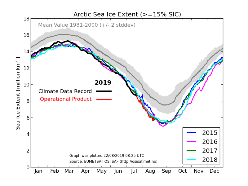
Figure 14. The large image of the Arctic Sea Ice Extent from the DMI on 22 August 2019. It is the end of the ice year; full years for 2015, 2016, 2017 and 2018 are shown. The 2019 Arctic Sea Ice extent plotted in red is and has been right in the middle of the four years mentioned above. The data show that the Washington Post statement on 8 August 2019, “Arctic sea ice is also at a record low as warmer than average summer takes its toll,” is contradicted by the DMI data.
An interactive view of Arctic Sea Ice Extent, this from the US National Snow Ice Data Center, is the Charctic Interactive Sea Ice Graph, which has among its default settings: Arctic,1981-2010 30-year median, (solid gray line) the current year, and the 2012 minimum extent year (dashed in Red). Optionally, it is interactive by pressing the wanted selections along the right side of the chart.
Here’s the plot I obtained on 23 August 2019:
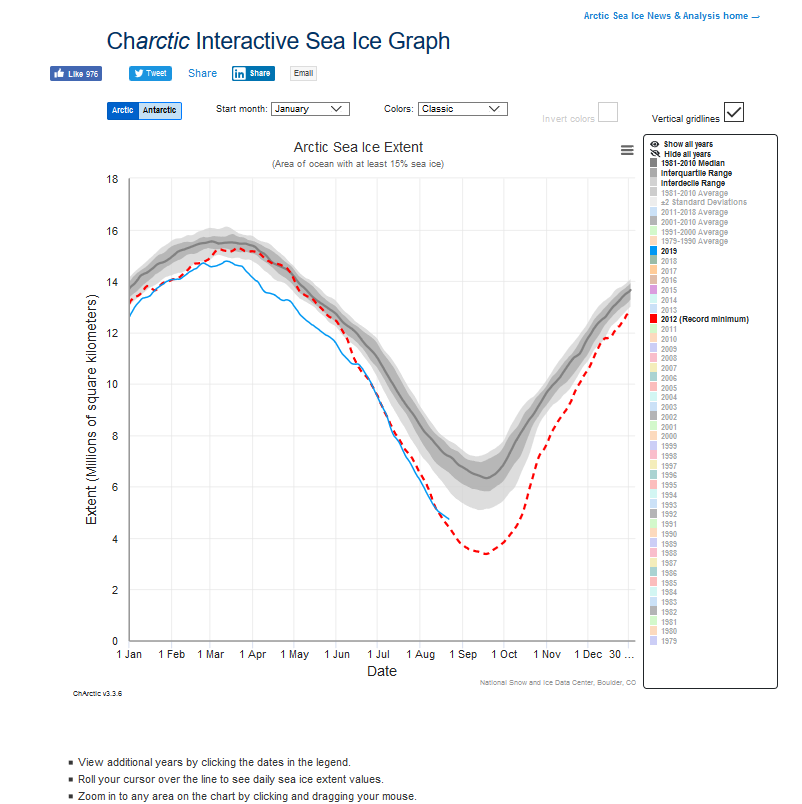
Figure 15. National Snow Ice Data Center Sea Ice Graph plotted 23 August 2019. This is the plot from NSIDCs “Charctic” Interactive Sea Ice Graph using default settings. The web version allows user-selected optional selections to be made for start month, colors, and any number of year choices by pressing buttons on the side of the screen.
The current 2019-year data show that the 2019 Arctic Sea Ice extent is well above the minimum extent of the 2012 year. This means that the Washington Post claim, “Arctic sea ice is also at a record low as warmer than average summer takes its toll,” is not true now, and the 2019 melt year is unlikely to upset the record low extent set in 2012.
Also, plotted MASIE data from the US National Snow Ice Data Center over the time domain of the MASIE data do not show Arctic Sea “at a record low.”
Heat Waves in Europe–A Very Old Story
Tony Heller has collected stories from books and newspapers from sources in Australia and the United States in 1500 years of heat waves , stories that show writers and journalists have been writing about hot weather in Europe for over 1000 years. He shows and I document many stories which describe extreme heat and extreme weather effects felt during heat waves of the past. During the latter portion of the Medieval Warm Period, Gaillard’s Medical Journal reported a heat wave in France so severe, “In 1303 and 1304 the Rhine, Loire, and Seine ran dry.” There are more instances at this link.
A Backward Glance
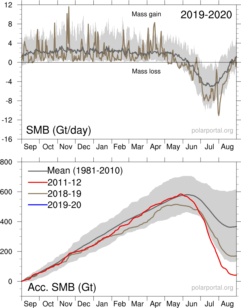
On 2 September 2019, I looked at the final plot for the 2018-2919 ice year; it provided useful lessons, some of which are shown in the plot below, Figure 16, again from Tony Heller’s blog. Tony annotated the Polar Portal’s final Surface Mass Balance plot for snow year 2018-2019 in bright blue with the claim by the Washington Post of the purported record low Greenland surface ice, the claim made by Andrew Freedman of the Capital Weather Gang.
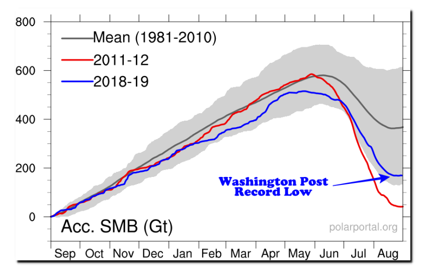
Figure 16. Final Surface Mass Balance determination by the Danish Meteorological Institute on 31 August 2019 for the snow and ice year 2018-2019. The claim by the Washington Post of a record low year is annotated in bright blue. Clearly, the Post claim was false, because the melt was well within the 30-year mean (the gray band) and far from the modern record set in snow year 2011-2012, the trace of red line late in 2012.
As an operational meteorologist for over 40 years, I find it stunning that the “Capital Weather Gang” of the Washington Post apparently does not look at extant data when they make their prognostications. At no time was the surface mass balance for 2018-19, the gray band in Figure 16, outside the previously measured history of 1981-2010. At the time the Post made this prognostication, 8 August 2019, the trend was more toward the center of the mean, rather than outside it. You can see the effect of 2012’s remarkable warmth with the red line in Figure 16.
Perhaps this tells us why the Post makes such errors:
The Post’s writers just don’t look at the data available to them, and they face no adverse consequence for getting their forecasts wrong. As a former Air Force Weather Officer, it would be personally humiliating for me to stand in front of assembled crewmembers and Commanders to explain such a “busted forecast.” Instead, the Capital Weather Gang seems to be immune from personal humiliation, because those who pay their salaries are part of the political class with no personal responsibility or technical imperative to “get it right.”
Conclusion
GREENLAND: June 2019’s melting in Greenland, decried as climate catastrophe by CNN, followed past such events in June, some of which were reported in the 1800s. The Washington Post claims of Greenland being “on track to lose most ice on record” were belied by the data posted daily at the Danish Meteorological Institute’s Polar Portal. The Post studiously ignored the huge ice accumulations of 2017 and 2018.
FRANCE: The heat in France was forecast well in advance, when an Omega Block developed at the Summer Solstice. Meteorologist reports indicate the heat came from strong southerly flow from Saharan Africa.
GERMANY: The new record in Lingen, Germany was caused by clear weather and a bowl-shaped observing area cluttered with equipment shelters and a 45-foot tree line on the east side of the bowl. Reflected sunlight, trapped heat, and obstructed wind flow contributed to the observed phenomenon. Germany’s DWD Lingen observing site clearly fails WMO standards.
ENGLAND: The new record at the Cambridge University Botanic Garden is related to proximity of the recently constructed (2011) Sainsbury Laboratory and (2004) Plant Growth Facility and the presence of bare ground near the instrument shelter, all in violation of WMO Class One observing standards. Farmers, meteorologists and barefoot kids know bare dirt gets a lot hotter than grassy areas.
The alleged new extreme maximum was a one-day weather event. According to the UK’s Met Office, July 2019 was an unremarkable 45th warmest since records began in 1660.
Hot, but Not Extremely So
The caterwauling from the mainstream media – and claims that 2019’s hot summer was part of human-caused CO2-fueled global warming and a direct cause of alleged extreme maximum temperatures – are just not true. Analysis of the claims and events reveals these were simply hot weather events in a warm summer; claims of new extremes are far-fetched and fade under scrutiny.
_____________________
Robert W. Endlich served as Weather Officer in the USAF for 21 Years. From 1984–1993 he provided toxic corridor and laser propagation support to the High Energy Laser Systems Test Facility at White Sands Missile Range.
He has published in the technical literature and worked as software test engineer at New Mexico State University. He was elected to Chi Epsilon Pi, the national Meteorology Honor Society, while an Air Force Basic Meteorology student at Texas A&M University. He has a bachelor’s degree in Geology from Rutgers University and a master’s in Meteorology from the Pennsylvania State University.
Wow! Exhaustive and convincing.
Thank you.
I can’t help but wonder if there’s a way to force Seth Borenstein (of the Associated Press) and the rest of the hysterics to read this?
Record Heat Wave Linked to Climate Change Killed 1,500 People in France This Summer
https://www.newsweek.com/summer-heat-wave-climate-change-killed-1500-france-1458205
But, the article says it would have been 15,000 (“that occurred during scorching summer heat wave back in 2003”) had it not been for a “a successful public awareness campaign.”
Any truth to any of this?
Thanks for great, detailed piece, Robert. Intellectualism, combined with facts.
“Facts and objectivity are no longer a Major Media distraction.”
Anonymous Heins
For John Garrett
Sadly, it is impossible to get many (almost any) on the Left to look outside their cocoons or bubbles. The lack of critical thinking or even the past practice for journalists to seek some sort of balance in their writing has escaped them, and it is obvious that their editors are equally unaware that balance might lead to critical thought , either at the Editor’s Desk or among the readership. In short, critical thought has eluded modern journalistic practice, especially in the AP and USA Today, but this obviously extends to the Washington Post, and many, almost all the MSM sources. Sadly, this lack of critical thinking has escaped many in the Academy; it is not required of students, professors, or the administrators.
For Mark Krebs:
Within my post there are links that could lead to answers to you question about the TIME article on heat wave deaths, specifically, my presentation graphics:
https://casf.me/wp-content/uploads/2019/08/PDF_The-2019-Heat-Wave-in-Europe_and-Beyond__What-The-Media-Didn-t-Tell-You__17_Aug_2019-updated-22-Aug-2019.pdf
and my link to this story by La Parisien http://www.leparisien.fr/societe/en-1911-paris-suffoquait-deja-
where over 40,000 died in Paris in 1911. My presentation graphics have a link to the National Library of Australia, https://trove.nla.gov.au/newspaper/article/58465077 which describes an 1832 heat wave in Paris which brought about a cholera epidemic and over 20,000 deaths in this episode. So, there is some truth to the TIME story that people are learning to cope.
However, four years ago USA Today quoted a study in the Lancet that says 20 times more people freeze to death from the cold than die from the heat, https://www.usatoday.com/story/weather/2015/05/20/cold-weather-deaths/27657269/
Fossil fuels have made our lives more comfortable and reduced the deaths from the elements by over 99%, https://wattsupwiththat.com/2019/01/27/inverse-hockey-stick-climate-related-death-risk-for-an-individuals-down-99-since-1920/
I thank Rob Bradley for kindly posting this on Master Resource. There are more of my posts and presentations at https://casf.me/
ROBERT W. ENDLICH
[…] https://www.masterresource.org/climate-exaggeration/europes-2019-heat-wave-the-rest-of-the-story/ […]
[…] Europe’s 2019 Heat Wave: The Rest of the Story […]