2011 U.S. Temperature Update: Alarmism Not
By Chip Knappenberger -- July 25, 2011The first six months of 2011 are now in the books. Heat waves are currently in the headlines, but how does the national average temperature compare to other years and ‘normal’? And what does the first half of the year portend for the year as a whole?
The indication is that 2011 will mark the continued return of U.S. national temperatures to conditions much closer to the 20th century mean, down from the unusually elevated temperatures that characterized the 1998–2010 period.
If this proves to be the case, it strongly suggests that the unusually warm decade from 1998–2007, was just that–unusual–and does not best represent the expected trend or the climate state of the U.S. for the next several decades to come.
Background
The U.S. National Climatic Data Center has compiled a data set representing the annual average temperature for the contiguous United States which dates back to 1895.
Figure 1 shows that history, from the beginning through 1997. Over that time, there was really not much worth writing home about—there were signs of inter-decadal variability, but nothing that seemed to scream “dangerous anthropogenic global warming!” The overall upward trend was being driven more by cool conditions in the early decades of the record, rather than warm conditions at the end of the record.

Figure 1. United States annual average temperature history, 1895-1997 as compiled by the U.S. National Climate Data Center.
But all that changed in with a big upwards temperature jump in 1998, which was due in part to the occurrence of a strong El Niño conditions in the Pacific Ocean. But in the years following 1998 U.S. annual temperatures remained elevated, even through the El Niño conditions abated (Figure 2). Many thought this heralded in a new climate state in the U.S. as well as better establishing the trend of things to come as anthropogenic greenhouse gas emissions continued to rise.

Figure 2. United States annual average temperature history, 1895-2007 as compiled by the U.S. National Climate Data Center.
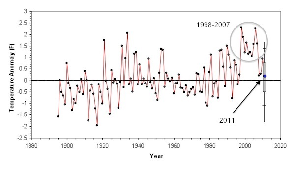
But, then, global warming’s influence on U.S. annual temperatures seemed to be derailed in 2008, when the national annual temperature fell off its lofty perch and returned to very near its 20th century average value.
Then 2009 followed suit, and 2010, while a bit warmer than the preceding two years, was still cooler than any year in the 1998-2007 stretch (Figure 3). Now, after three relatively near-normal years, the 10-yr warm period from 1998-2007 was starting to look to be out of place, rather than the new norm.

Figure 3. United States annual average temperature history, 1895-2010 as compiled by the U.S. National Climate Data Center.
2011 to Date
Ever curious to see how this is continues to play out, I thought I’d check out how 2011 was shaping up, with the first 6 months of the year now in the books. From January through June, the average temperature in the U.S. has been just 0.14°F above the 20th century average.
I’d like to use this information to guide a guess as to the final year-end number for 2011.
Admittedly, this is a somewhat dangerous thing to do, so I am not betting the farm that the behavior for the next six months will follow closely that of the first six months (after all, currently, as much of the country well knows, things are a bit toasty). But, the first six months does provide a pretty decent anchor for the annual temperature and can help frame a prediction.
Figure 4 shows the distribution of the difference between the annual temperature anomaly and the temperature anomaly for the first half of the year for the collection of 116 years from 1895 through 2010. The mean of the distribution is 0.00°F, he standard deviation is 0.62°F (~2/3rds of all data points lie with +/- 1 standard deviation of the mean), and the maximum positive difference was 1.52°F while the maximum negative difference was 1.95°F. I’ve have plotted a normal distribution on Figure 4 to show that the actual distribution, while not perfectly normal, is close enough for my purposes.

Figure 4. Distribution of the difference between the annual temperature anomaly and the temperature anomaly observed during the first 6 months of the years, for the contiguous United States (Data source: U.S. National Climatic Data Center).
Using the statistics derived from the distribution described in Figure 4, I can make an frame the 2011 annual temperature prediction based upon the observe temperature for the first 6 months of the 2011 (Figure 5). And looking at Figure 5, it seems that there is a pretty good chance that the final numbers for 2011 will fall below the typical elevated values during the period 1998-2007. Marking the 4th year in a row of such an occurrence.

Figure 5. Projected value for the U.S. annual temperature for 2011 based on data for the first six months of the year. The blue dot at the end is the current year-to-date (January through June) temperature anomaly. The grey bar represents the region where there is about a 2/3rds chance that the 2011 annual temperature will end up being. The hash marks above and below the grey bar indicate the region where there is about a 95% chance the 2011 annual temperature will ultimately fall, and the vertical line represent the limits of the 2011 annual temperature, based on observations from 1895–2010. (Data source: U.S. National Climatic Data Center)
In other words, the return of U.S. average annual temperatures to values close to the 20th century average conditions seems to be continuing in 2011.
The 10-yr warm spell from 1998–2007 had the effect of raising the overall trend in U.S. annual average temperature by about 40%, from a value of ~0.75°F/century (from 1895-1997) to a value of ~1.25°F/century (1895-2007) and raised concern than anthropogenic global warming was really beginning to leave a significant mark on the climate of the U.S.
But the last three years, 2008–2010, and now the projections for 2011, lie much closer to an extension of the 1895–1997 trend line than the 1895-2007 trend line (Figure 6).

Figure 6. Same as Figure 5, except with the extended trend lines from 1895-1997 (dashed red line) and 1895-2007 (solid red line) added.
If 2011 ultimately turns out to come in in-line with the central projections in Figure 5, it will strengthen the suggestion that the unusually high temperature that characterized the 10-yr period from 1998–2007, were just that, unusual, and do not best represent either the expected trend or the climate state of the U.S. for the next several decades to come.
[…] Warming 101ContributorsEnergy and Environment Newsby William Yeatman on July 25, 2011in Blog Tweet 2011 U.S. Temperature Update: Alarmism Not Chip Knappenberger, Master Resource, 25 July 2011The Great CAFE Stick-up Henry Payne, Planet Gore, […]
My approach would be to see what the twelve month moving average has been doing. Here is what it looks like, with the previous three calender years also marked as dots, and the whole period average as a black line:
http://i23.photobucket.com/albums/b370/gatemaster99/USTemp2011.png
This basically confirms that the temp has been heading for the average line for a bit, and is shaping up to be another near normal year like the last three. ENSO is neutral right now and we are still in a positive AMO, AFAIK, which makes me wonder, why isn’t it warmer? I guess it could be related to the PDO, which hasn’t caught up to current ENSO conditions yet, and is still negative. Still, it seems to me like the “underlying warming” is pretty weak.
Beware of data purporting to show the average temperature. Weather stations do not record average temperature but rather the maximum and minimum temperature and they split the difference and call it average. That’s not the average but the median. In thermdynamics temperature is an intensive parameter, i.e. it does not scale, so how can you average it? Average temperature is physically meaningless. You can’t take a thermometer and measure the average temperature because it has no physical existence. It only has a metaphysical existence.
Beware “undata” purporting to be data.
Data become “undata” when they are adjusted, normalized, infilled, homogenized, pasteurized, folded, bent, spindled, mutilated and otherwise changed from the original instrument readings. “Undata” then become the global surface temperature record through some magical, mystical process.
Not even Rumplestiltskin could turn bad data and missing data into good data.
I echo Ray’s point. Beware of reading too much into temperature data. The temperature is affected by a lot different sources. Particulate levels and El Nino has a large effect on temperatures, as well as greenhouse gases.
Instead, the clearest way to see the impact of CO2 on the ‘forcing function’ is to look at the IR leaving the Earth at the frequency that CO2 absorbs. This is done by looking at satellite data. The data below shows that CO2 absorbed more IR in 1997 than in 1970, and by an amount expect by the rise in CO2 concentration between 1970 and 1997.
So, to reiterate, temperature data can be easily misconstrued, so the better way to test a hypothesis about whether CO2 emission can increase the ‘forcing function’ is to look in the IR.
http://www.nature.com/nature/journal/v410/n6826/abs/410355a0.html
Robert O’Neil-No one is questioning whether CO2 acts as a “forcing” the question is, how much warming results from that, and does that cause significant problems for society? You can’t demonstrate that with spectroscopy.
On the topic of this post, I found something interesting when comparing the GISSTEMP version of US data and NCDC’s (converting GISS to Farenheit scale (x1.8), and adding in 1951-80 average of calender year temps of NCDC. The difference between them, NCDC-GISS results in an upward trending curve:
http://i23.photobucket.com/albums/b370/gatemaster99/NCDCminusGISSUS.png
Notice that at the end the curve is positive by between .2 and .15, and this is very similar in size to the anomaly Chip is predicting for 2011. So my question is, what method is better, how GISS calculates anomalies or NCDC? It might be the difference between a marginally above average year and an exactly average year.
[…] at MasterResource.org, Chip Knappenberger elucidates why this is the case—catching us up on the temperatures thus far […]
I posted my earlier comment because, in general, I like read this blog, but it seems to me that the posts related to climate change are one-sided, like knee-jerk reactions to the extreme views stated by deep environmentalists that we need to go back to CO2 levels of 350 ppm.
I do not know what is the optimal level of CO2 in the atmosphere. Right now, we seem to be unable to predict the future temperature, let alone the economic impact of a given temperature rise. But as we collect more data, we may be able to do a better job of estimating the economic damage for emitting a ton of CO2. (so that we can determine the externality for emitting a ton of CO2.)
The person that has done the best job at this (according to the research literature I’ve seen) is Richard Tol. (see article below)
http://www.econ.yale.edu/~nordhaus/homepage/documents/Tol_impacts_JEP_2009.pdf
What’s interesting is the Tol’s analysis of prior studies (that estimate economic damage vs. temperature) suggests that climate increases of up to 2 deg C have a positive economic impact, but that after a rise in 2.5 deg C, the impact of increased temperatures becomes negative really quickly.
Given the known greenhouse effect of CO2 by which it increases the ‘forcing function,’ many of us are concerned about the environmental and economics damage from letting CO2 levels go above ~600 ppm (which would could be reached by 2100 at today’s trend.)
I do not know what your belief is on this matter, but my opinion is that we should follow the path that leads to the greatest growth for life in total. This might mean needing to tax CO2 or it might not, depending on how close we are to the optimal amount of CO2 in the atmosphere.
As we’ve seen before in the 1960’s, the emission of CO2 and particulates have ‘forcing functions’ that can cancel with each other. What we desperately need is a model that can actually predict future temperatures. The question is: do you have a model that can predict future temperatures?
What do you think will be the global average temperatures over the next decade?
When I read this article, it seemed to me that you assume that the Earth’s temperatures will remain <1 deg C above 1900-2000 average. Do you have a model for this, or is this just a guess?
[…] at MasterResource.org, Chip Knappenberger elucidates why this is the case—catching us up on the temperatures thus […]
No one has a model that works both forward and backward, so no one has a good model. The scandal in the scientific community has been downplayed by the (semi-hysterical) press, but the effects going forward are truly awful. The preposterous claims made by the nicely funded (with public money) academics (e.g. we didn’t have storage space for the raw data and threw it out!!!! Data storage is essentially free today…); the bullying of the dissenters; the “recalculation” of data uncongenial to the desired results…all this has had a devastating effect on the public’s attitude toward any and all pronouncements from the “experts” in matters of climate. The no-result “reverse show trials” of teh miscreants was the final straw.
How to go forward with serious science when most thinking people have a (correct) attitude that amounts to this: the folks talking about this are proven frauds and humbugs: drowning polar bears indeed!
The matter deserves the very best from our scientific community, and the smirch is on everyone associated with the past frauds, and the utter failure of those not involved to discipline the miscreants.
Forget who has a model…who has a way to enforce ordinary scientific discipline? Need I repeat the basics? Open, public, replicable analysis and experiment; the originator of the results taking pains to point out every possible difficulty and source of uncertainty in the process; agreement of the theory with observable facts; and on and on….well, every one of these tenets has been sacrificed in the zeal of the unscientific scientists to get the desired solution. The very first rule of life a scientist should learn is this: The degree to which you like or wish for an idea to be true is entirely unrelated to the truth of the idea. Period. End of discussion. Why did the crisis, which has neutered the entire community, happen? Answering that question NOW is more important than finding a good model. We will find a model much faster with honest science.
Do I sound angry?